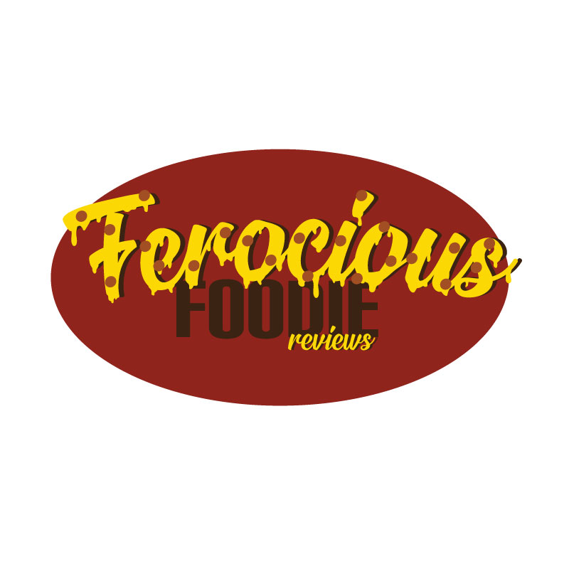
For this project I decided to make a logo with letters that look like oozing pepperoni pizza using a warm color palette of reds, yellows, and oranges. I decided to use these colors because many food companies use reds and yellows because of the association of food to those colors.
Pizza is one of my favorite foods and I thought it would work well in a logo because it is instantly recognizable. Originally, I was going to have a pizza slice behind text but after some sketching, I found that it would be interesting to have the letters be the toppings of the pizza.
After thinking of this idea, I went to research how I might be able to accomplish this design. First off, I found a YouTube tutorial from Spoon Graphics that helps explain how to make “dripping” letters. Here is the link to that video.
From this video I learned the techniques used to create the drips onto a font. I had difficulties following his directions because of the fast pace of the video as well as some of the functions not in the same location on screen as his. So far, the drips are not perfectly like his although I did want them to be slightly different as slime and melted cheese have their differences.
After watching the tutorial, I started the design by looking for fonts to use that would help create this design. For the words “Ferocious” and in “reviews” I used the font Signatra.
ps://www.dafont.com/signatra.font?psize=l&back=theme
What I used for the “Foodie” in the design is the font Carbon.
https://www.1001fonts.com/carbon-font.html
After finding these fonts, I added the drips to the top text, experimented with color and warping the text to make an arch, as well as adding some pepperoni slices. Once the colors for the font were decided, I added a background oval to create a background for the letters.
For my final draft I hope to refine the drips on my letters and to make the pepperoni slices look like they are embedded into the cheese.

Hey Addy, I love the logo that you have created for the draft. It is a direct connection to the topic that you have selected for the course. The way you made the text look like cheese melting and added the pepperoni so that it looks like a pizza was genius. Something that I notice is that the word “foodie” and the red oval are both dark colors and it makes reading it a little difficult. Changing the color of the word or using a brighter color of red for the oval will make it easier to read. Another suggestion that I have is removing the drop shadow on the first word on the logo. The way that it is with the shadow looks good, but I feel like removing it will make the logo have a cleaner look overall. All and all the logo looks awesome and I don’t see much that needs to be adjusted.
LikeLike
– This is such a strong logo idea. Your description and creative process is particularly impressive – it is clear to see that you’ve gone the extra mile with picking out your own unique fonts too. Very good! To improve this logo, and although you mentioned this yourself, to improve I agree that you should embed the pepperoni effect into the cheese. Maybe you can do this by changing the opacity and playing around with various shapes too so that they are not all circle. This could add even more dimension to your logo. Overall though, excellent job! Really couldn’t fault much.
LikeLike
I absolutely love your design! I’m having a bit of trouble finding something to critique, to be honest with you. The font is super fun, the colors are complementary, and it has depth! The design also looks super resizable, even with all of the text. My only suggestion is maybe you could make the word “Foodie” a bit more noticeable, with such a neutral brown next to the vibrant yellows the text is less noticeable. And just because I need to have two critical points, perhaps the font for “reviews” could be a bit larger for resizing purposes. Otherwise, it’s an extremely strong design! Well done.
LikeLike
Some advice that I was given that I want to implement in my final draft would be changing the shapes of the pepperoni and making the pepperoni look embedded into the cheese. When I was making my draft I had the same idea but wasn’t sure how to do it. After that, I want to change the color of the background circle. The colors are too similar in shade and are hard to differentiate between. I might consider making the foodie a white color to intensify the contrast. Another suggestion I received was to change the shadow behind the first word, “ferocious”. This is something that I want to give a try but might not keep in the final draft. When I was working on my draft, I made the shadow to help make the text pop. I’m not sure I will be able to replicate the pop-out effect without a shadow.
LikeLike
I love your logo! I love the idea of the oozing font. It emphasizes the theme without being distracting. I also liked how you have layers in your logo making it look almost 3D. The letters Foodie is a little faded in the back. However, I really like the color that you choose. I wonder if you could use the same color yellow or a darker yellow and outline foodie. Then it will still pop with the logo. I also like the consistency through your logo. You chose two basic colors and stuck with it. The font of “Ferocious” and “Reviews” are also both in cursive also making the logo look consistent. I also think it is awesome that you went out of your way to do extra research to learn how to do oozing letters.
I didn’t realize you wanted the background to be the pizza and the letters were toppings. To make your point look more clear I wonder if you could add a crust around the oval. Also, could you add other pizza toppings like green peppers or olives and scatter them around the logo? I think this might help emphasize your theme. However, if you’re looking for a simple logo then I think your current logo looks really great!
LikeLike
So first off, the design is very attention grabbing. I think that when you see it you know exactly what you are going to get, and the fact that it looks like melting cheese on pizza is really cool as well. If I could change anything maybe it would be the background color of the design because I would like to see a color that pops more and for me when I see the colors yellow and red together I actually start thinking of Mcdonalds and you don’t want to be associated with any other brand than your own. Something else I would do would be to brighten the dots on the letters so that someone can tell that it is pepperoni and not just spots.
LikeLike