Final Reflection

My favorite projects of this semester were both the logo project as well as the graphic design project. I have used both Photoshop as well as Illustrator before so there was less time spent on learning how to use the programs and I was able to focus more on the creative process of the projects. Here are the final products of both of those projects.

Graphic Design Projects
Logo Design Project

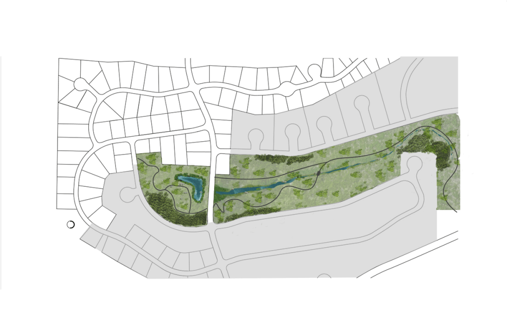
             Although I have used Illustrator before in other courses, the tutorial assignments helped show me new ways of using the program and taught me techniques that make everything much easier. With my major being landscape architecture, Illustrator is a beneficial tool in creating design graphics and I will be able to use the skills that I learned in class to create graphics such as the one below I created for my design studio.

Masterplan Design for LA 470 Design Studio

             For my future, I hope to work in a landscape architecture firm as a graphic design specialist. I have found from this class as well as m design studio class that I really enjoy the creative process of making graphics. The tools I have gained from the Photoshop and Illustrator portion of this course will help me tremendously.

             A skill that I wished I could have learned is Adobe Lightroom. That program might be more advanced for this course, but I have always been curious of how the program works and what applications could be beneficial to my graphics.

             A website that I found to be extremely helpful was YouTube. There are so many tutorials on YouTube for anything you are trying to do and if I got stuck on a specific problem it usually would help. I used a YouTube tutorial to get the dripping cheese effect of my logo design that I envisioned in my sketch and it was found with a simple search. Here the tutorial is linked below.

The last assignment…my final video story.

For my video project, I took inspiration from videos I have seen on YouTube in the past. I was specifically drawn to videos where there is a voiceover that describes what is happening in each frame of the video to effectively tell a story. I wanted to show what a typical night is for me when I don’t want to eat any of the food that I have in my apartment. I thought this would be a fun and interesting way to bring in my topic of food reviews into a story format.

In the video I explain each part of the meal at La Casa Lopez, while the video footage gives the audience the visuals to picture the atmosphere better. I show a progression throughout the meal and the emotions that I am feeling each step of the way. For my original draft, I did a voiceover of the step by step experience of my meal to add some humor to the video as well as setting the scene.

This format was well received by the group members in the feedback assignment, but they did have some suggestions for improvement. This included adding music and text. Listening to their suggestions, I used a copyright free audio from YouTube music studios as well as text at the end of the video. I think these additions helped the video overall have a more complete design.

A suggestion that I did not take was changing the lighting in the video to be more cohesive. I think due to my inexperience with this program, I wasn’t able to adjust the lighting to match quite right and it ended up looking worse than it did before. That is a skill that I will have to develop later.

Music Credits:

Island by MBB https://soundcloud.com/mbbofficial
Creative Commons — Attribution-ShareAlike 3.0 Unported— CC BY-SA 3.0
Free Download / Stream: https://bit.ly/Island-MBB
Music promoted by Audio Library https://youtu.be/6by8zhaG04Y

The Final Podcast

For my audio story project, I have created a narrative story segment in a podcast style. I thought this format would be best to complement the existing content that is part of my blog already. I chose a story of how I found the best happy hour in the Pullman-Moscow area for this project because it relates to my food review topic. This story helps connect the listeners to the experiences I have when visiting these restaurants.

The elements of my audio stories are the intro, the main story, and the background music to make the story more relaxed. My intro was inspired by the introduction used on many podcasts where they have a signature sound to make the podcast more recognizable. For the end of my introduction I also recorded sounds of me opening and drinking out of a can. This element was inspired by the production credits shown at the beginning of movies where short and concise images are shown to let the audience know what companies were involved with the making of the film. I thought this would be a creative way to specialize my podcast from others.

For the background music, I visited the website that was suggested within our readings, Freesound.org, and used the audio titled Free Music Background Loop uploaded by the user Slaking_97. This audio is free to use and remix as long as the owner is credited. This audio can be found at https://freesound.org/people/Slaking_97/sounds/459706/.

After posting my draft version of my audio story, I received feedback that I needed to have a clear beginning, middle, and end to my story and to focus more on the main details. To help this issue, I re-recorded my story being clearer and more concise, as well as adding more of my personality into the audio. I made sure that I knew exactly what points of the story I wanted to get across so the listener could follow along better. Another critique that I had received was the fact that the background music was too loud, so I lowered the volume to make sure the audio was not being overshadowed.

The Final Logo

For the initial design, I chose to use pizza as an inspiration for my logo because it is easily recognized and is one of my favorite foods. I also know that many food companies use reds and yellows in their designs such as McDonald’s and Cheez-It, as it has associations with food. I originally was going to incorporate a shape of pizza, but then developed the idea of pizza within the letters of my food blog name.

               For my first draft of my design, I researched online how to make letters that looked like gooey cheese so that the word “ferocious” could better resemble part of a pizza. For this effect and design to look the way I wanted, I found different fonts such as Signatra found using this link https://www.dafont.com/signatra.font?psize=l&back=theme, and the font Carbon found using this link https://www.1001fonts.com/carbon-font.html.  After incorporating these fonts, I added a darker red oval shape behind the letters to help the yellow of the cheese to stand out against its background as well as a shadow behind the word “ferocious” to help. The final touch I made was the incorporation of pepperoni slices to the top of the cheese letters.

               From my draft design I received some great feedback to help me improve upon my design. These critics included removing the shadow of the word “ferocious”, making the pepperoni slices look more embedded into the pizza and not as perfectly circle, increasing the size of the word “reviews”, and changing the color of the word “foodie” to make it stand out better.

               The revisions that I had made on my design included editing the pepperoni slices, changing the color of “foodie” to white, adjusting the shadow on “ferocious”, as well as re-scaling the words to maximize the readability. To make the pepperoni slices seem to be better on the pizza, I added a radial gradient to the slices making the outer edges darker than the center like how real pepperoni toasts on an actual pizza. I also used the knife tool to cut some of the edges off the pepperoni where it overhangs the letters underneath and distorted the circular shapes to have little irregularities.

Logo Design Draft

For this project I decided to make a logo with letters that look like oozing pepperoni pizza using a warm color palette of reds, yellows, and oranges. I decided to use these colors because many food companies use reds and yellows because of the association of food to those colors.

               Pizza is one of my favorite foods and I thought it would work well in a logo because it is instantly recognizable. Originally, I was going to have a pizza slice behind text but after some sketching, I found that it would be interesting to have the letters be the toppings of the pizza.

               After thinking of this idea, I went to research how I might be able to accomplish this design. First off, I found a YouTube tutorial from Spoon Graphics that helps explain how to make “dripping” letters. Here is the link to that video.

               From this video I learned the techniques used to create the drips onto a font. I had difficulties following his directions because of the fast pace of the video as well as some of the functions not in the same location on screen as his. So far, the drips are not perfectly like his although I did want them to be slightly different as slime and melted cheese have their differences.

               After watching the tutorial, I started the design by looking for fonts to use that would help create this design. For the words “Ferocious” and in “reviews” I used the font Signatra.

ps://www.dafont.com/signatra.font?psize=l&back=theme

What I used for the “Foodie” in the design is the font Carbon.

https://www.1001fonts.com/carbon-font.html

               After finding these fonts, I added the drips to the top text, experimented with color and warping the text to make an arch, as well as adding some pepperoni slices. Once the colors for the font were decided, I added a background oval to create a background for the letters.

               For my final draft I hope to refine the drips on my letters and to make the pepperoni slices look like they are embedded into the cheese.

Sketching for a Logo

My sketch shows the words “Ferocious Foodie” with the “Ferocious” being gooey pizza slices with “Foodie” being a simple bold font. I thought this design would be eye catching, portray the intent of my blog, and would be easily readable.

A Revised and Renewed Graphic Design Project

The concept that I decided for my graphic design project is a web graphic that would be used on a blog. With my topic being reviewing restaurants within Pullman, WA and Moscow, ID, I decided it would only be appropriate for me to include food I’ve eaten at restaurants that are in those areas. I used pictures of food that are from restaurants in Pullman as the starting point for my design, and from there I chose an analogous color palette that would compliment those pictures.

I took inspiration from media found online, such as YouTube thumbnails for ideas on eye catching and vibrant compositions. After cutting the food out from their background, adding effects to the images, implementing geometric shapes with various blend modes, and adding text, I had completed my first draft of the project.

After completing my first draft, I received feedback from my classmates. The comments I received suggested edits within fixing spelling errors, adjusting the color of the darker smaller text, as well as the brightening the sliders located on the corner of the graphic.

From these suggestions, I experimented with the colors and shapes I used overlaid on top of the food images to make sure that each picture of food was bright enough and there was equal distribution of light and dark among the design. I adjusted the smaller darker text by changing the color to be a darker purple-ish black as well as made the text a few sizes smaller to make the main text the focal point of the design. The last and final revision I made was to bring the gyro to the front of the image. By doing this I was able to add some more variation in the layers of the design.

After completing this process, I have gained more appreciation for the art of graphic design. Photoshop is not always easy to use, and I would come across problems that I would have to find the solutions to on my own. This slows the process down and can cause some frustration. I was able to overcome these obstacles by taking breaks and watching tutorials online. What I gained from this experience was an opportunity to experiment with the many functions of Photoshop and I have improved my skills within the program substantially.

Graphic Design Project

For this project, I have created a web graphic that would function as a header for a blog. I aimed for a header that was eye catching, colorful, and geometric. I created this project with three of my personal photos that I had taken at restaurants in Pullman earlier this year. I started the design process with removing the backgrounds of the food images to have a cleaner look. I adjusted the saturation and the hues of the images as well as change the color balance to optimize the photos.

Color

I chose color inspiration from the food itself, specifically the reds within the pizza sauce. This guided the color palate for the rest of the design process. I used analogous colors to blend the images with the rest of the graphic. I had a great time playing with saturated and unsaturated colors and trying to be dramatic but not overpowering.

Form

I added elements of geometry to my design with ovals and rectangular shapes. With the shapes I used the free transform tools to make their form more irregular and interesting. To get the sheer appearance for the geometric elements, I experimented with the blend modes using both the hard light and soft light functions.

Font

When choosing the font, I opted for more of a popular style that is prevalent on social media platforms such as Facebook and Instagram to add a more familiar aspect to the project. I used font colors that are within the colors of the food images to help everything blend together.

Inspiration

My inspiration for this graphic type comes from what I see on my social media. I am someone who spends time everyday to catch up with my favorite video creators on YouTube. Most of the time the thumbnails for these videos are Photoshop masterpieces themselves. They use many of the techniques we have learned throughout this course. Many times, those thumbnails are so eye-catching that more people are drawn to click on their video. I tried to recreate this idea but within my blog topic.