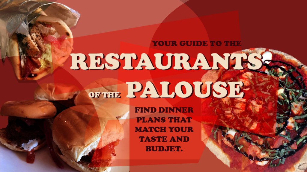
For this project, I have created a web graphic that would function as a header for a blog. I aimed for a header that was eye catching, colorful, and geometric. I created this project with three of my personal photos that I had taken at restaurants in Pullman earlier this year. I started the design process with removing the backgrounds of the food images to have a cleaner look. I adjusted the saturation and the hues of the images as well as change the color balance to optimize the photos.
Color
I chose color inspiration from the food itself, specifically the reds within the pizza sauce. This guided the color palate for the rest of the design process. I used analogous colors to blend the images with the rest of the graphic. I had a great time playing with saturated and unsaturated colors and trying to be dramatic but not overpowering.
Form
I added elements of geometry to my design with ovals and rectangular shapes. With the shapes I used the free transform tools to make their form more irregular and interesting. To get the sheer appearance for the geometric elements, I experimented with the blend modes using both the hard light and soft light functions.
Font
When choosing the font, I opted for more of a popular style that is prevalent on social media platforms such as Facebook and Instagram to add a more familiar aspect to the project. I used font colors that are within the colors of the food images to help everything blend together.
Inspiration
My inspiration for this graphic type comes from what I see on my social media. I am someone who spends time everyday to catch up with my favorite video creators on YouTube. Most of the time the thumbnails for these videos are Photoshop masterpieces themselves. They use many of the techniques we have learned throughout this course. Many times, those thumbnails are so eye-catching that more people are drawn to click on their video. I tried to recreate this idea but within my blog topic.

My initial thoughts when I looked at your Graphic Design Project Draft was that I love your topic. I wish I would have thought of this so I do a project with the excuse to go eat good food. I really like the text and titles that you used on your draft, they remind me of the lettering that you often find in a menu when going to a restaurant to eat. I think that is very clever because your topic is food of the palouse. You did mis-spell ‘budget’ so I hope that is among the first things you change when you are composing your final draft. Also, I think that you have excellent pictures the only issue is seeing them. Your draft is so saturated with reds that it is difficult to make out the details of your images. I would recommend bringing your images to the front in order to make them stand out more, otherwise I would recommend that you get rid of the red blocks all together because it may take away from your final draft.
LikeLike
My first impression of this is that it looks great. This seems like something I would see on a website for food on the Palouse. I really like the overlapping colors with food placed in the corners of the image. I think you worked in the text well and implemented it into the design very well. Something you might want to change is the lighting for the burgers and possibly the black text (my eyes aren’t the best for I’m not for sure on this) because it looks like they are different shades of black, however I do think that black was a good choice for the design. You might play around a little more with the over lapping red colors but they seem pretty good right now. I think overall this is a great start to your project, there is always more that can be done but as far as drafts go, this one is definitely up there in terms of quality and thoughtfulness of design.
LikeLike
I am so glad that someone in my group is doing their blog on food. Your draft looks as delicious as the food. You did a really good job with coloring in your post. The shades of red not only give a depth to the overall image, but really compliment the food images as well. Speaking of food images, I do think that you could brighten up the left front slider a little more so we can see the food better. The other 3 are fine with light levels but it may be worth trying to get the one a little better. This is a pretty complete project in my opinion, but if I had to say anything else, I would suggest making the black text a little bit darker. That way it is a bit easier to read. Other than that minor detail there is really nothing else I can suggest. You nailed this one.
LikeLike
I received some great feedback on my project from my classmates that I will definitely take into action for my final draft graphic. First on the agenda is to take care of my spelling error as well as any differences in the colors of the darker fonts to make sure my graphic is as clean and professional as possible. After that, I would try experimenting with the saturations on the images of the food. One of the comments from my classmates was that the sliders looked dark in the image and that the brightness could be adjusted to make the image pop more in the design. I also think that the saturation of the reds could be approved upon. Something that I might do for my final draft is to add more food images. I think It will be interesting to try a fuller graphic. Something else that could take some adjusting is font sizes to provide a clean and readable graphic.
LikeLike