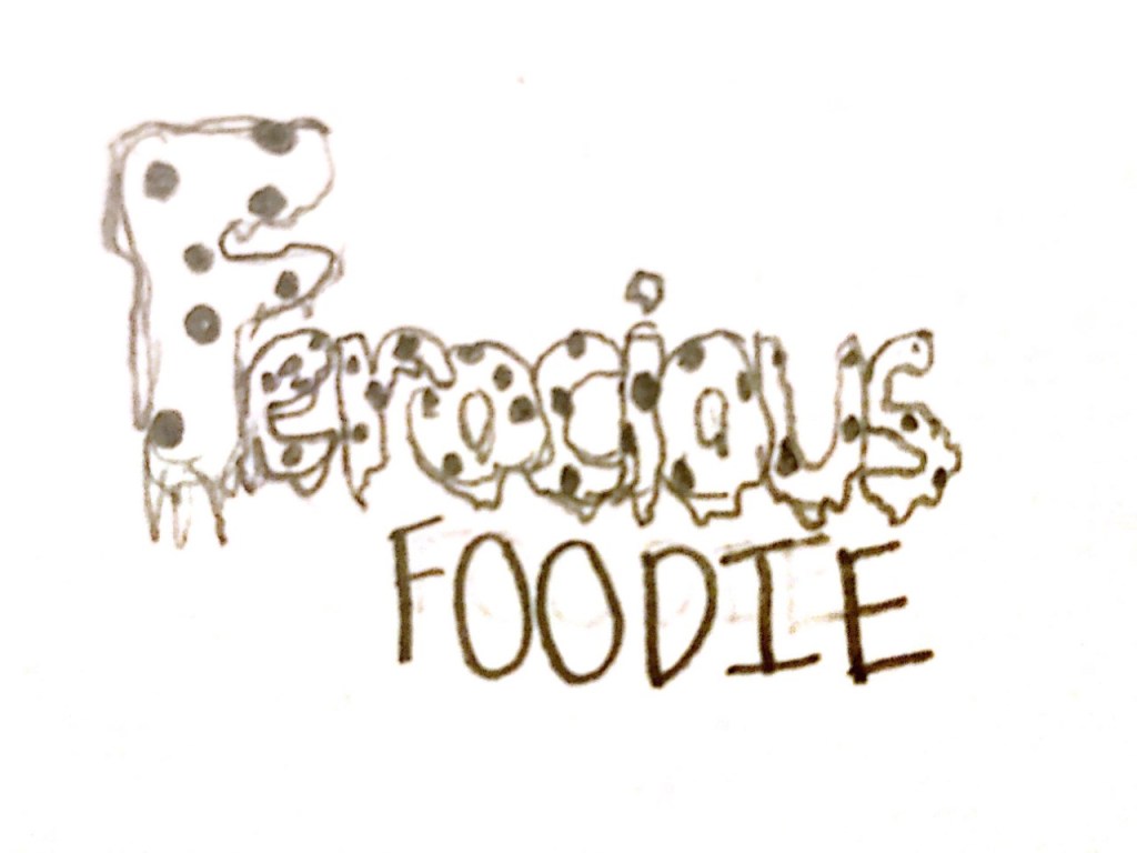
My sketch shows the words “Ferocious Foodie” with the “Ferocious” being gooey pizza slices with “Foodie” being a simple bold font. I thought this design would be eye catching, portray the intent of my blog, and would be easily readable.
My sketch shows the words “Ferocious Foodie” with the “Ferocious” being gooey pizza slices with “Foodie” being a simple bold font. I thought this design would be eye catching, portray the intent of my blog, and would be easily readable.
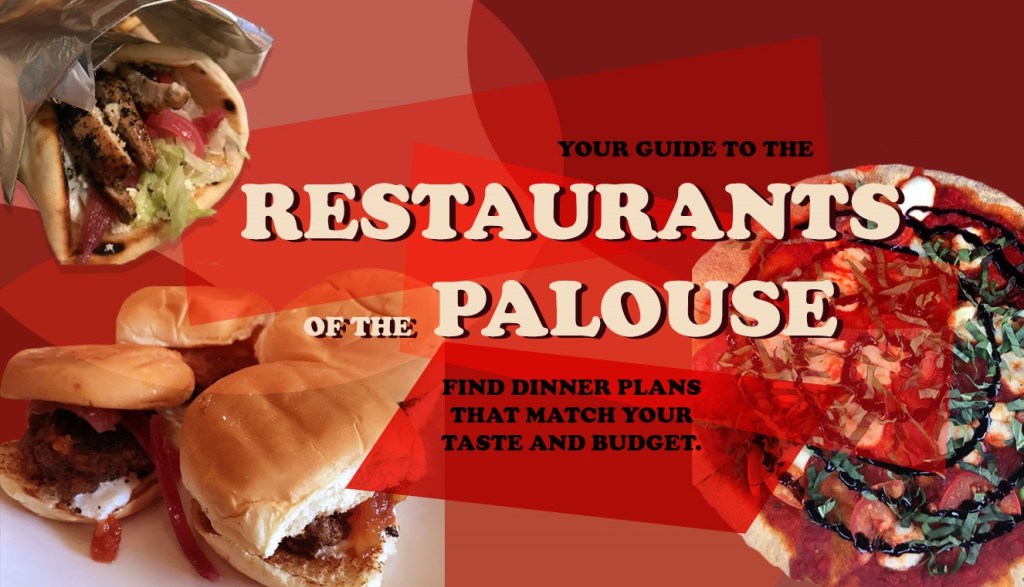
The concept that I decided for my graphic design project is a web graphic that would be used on a blog. With my topic being reviewing restaurants within Pullman, WA and Moscow, ID, I decided it would only be appropriate for me to include food I’ve eaten at restaurants that are in those areas. I used pictures of food that are from restaurants in Pullman as the starting point for my design, and from there I chose an analogous color palette that would compliment those pictures.
I took inspiration from media found online, such as YouTube thumbnails for ideas on eye catching and vibrant compositions. After cutting the food out from their background, adding effects to the images, implementing geometric shapes with various blend modes, and adding text, I had completed my first draft of the project.
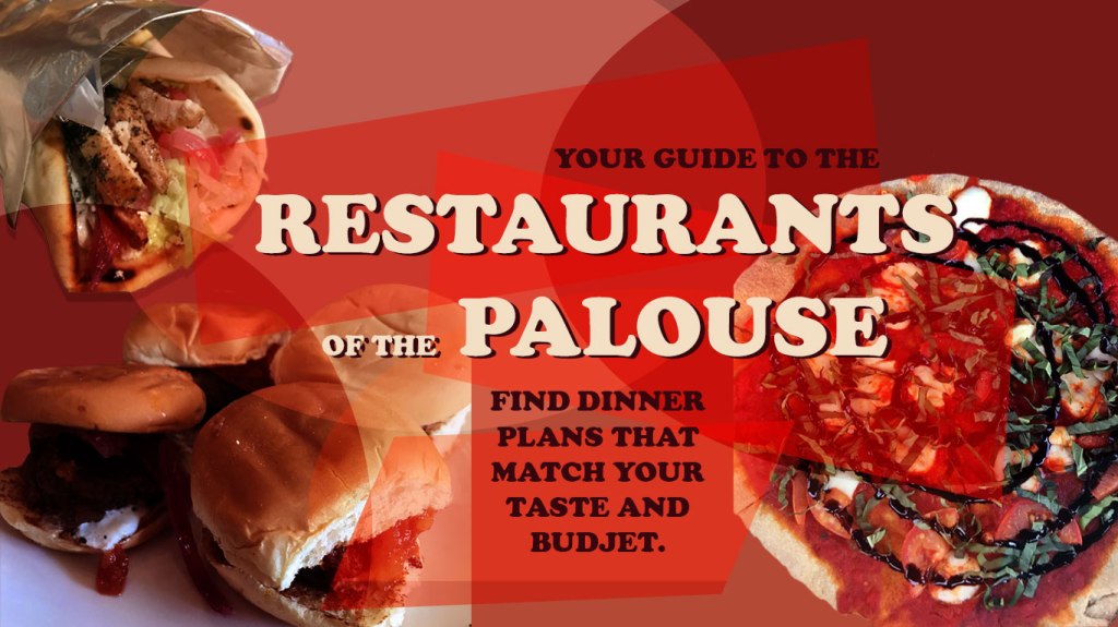
After completing my first draft, I received feedback from my classmates. The comments I received suggested edits within fixing spelling errors, adjusting the color of the darker smaller text, as well as the brightening the sliders located on the corner of the graphic.
From these suggestions, I experimented with the colors and shapes I used overlaid on top of the food images to make sure that each picture of food was bright enough and there was equal distribution of light and dark among the design. I adjusted the smaller darker text by changing the color to be a darker purple-ish black as well as made the text a few sizes smaller to make the main text the focal point of the design. The last and final revision I made was to bring the gyro to the front of the image. By doing this I was able to add some more variation in the layers of the design.
After completing this process, I have gained more appreciation for the art of graphic design. Photoshop is not always easy to use, and I would come across problems that I would have to find the solutions to on my own. This slows the process down and can cause some frustration. I was able to overcome these obstacles by taking breaks and watching tutorials online. What I gained from this experience was an opportunity to experiment with the many functions of Photoshop and I have improved my skills within the program substantially.
For this project, I have created a web graphic that would function as a header for a blog. I aimed for a header that was eye catching, colorful, and geometric. I created this project with three of my personal photos that I had taken at restaurants in Pullman earlier this year. I started the design process with removing the backgrounds of the food images to have a cleaner look. I adjusted the saturation and the hues of the images as well as change the color balance to optimize the photos.
Color
I chose color inspiration from the food itself, specifically the reds within the pizza sauce. This guided the color palate for the rest of the design process. I used analogous colors to blend the images with the rest of the graphic. I had a great time playing with saturated and unsaturated colors and trying to be dramatic but not overpowering.
Form
I added elements of geometry to my design with ovals and rectangular shapes. With the shapes I used the free transform tools to make their form more irregular and interesting. To get the sheer appearance for the geometric elements, I experimented with the blend modes using both the hard light and soft light functions.
Font
When choosing the font, I opted for more of a popular style that is prevalent on social media platforms such as Facebook and Instagram to add a more familiar aspect to the project. I used font colors that are within the colors of the food images to help everything blend together.
Inspiration
My inspiration for this graphic type comes from what I see on my social media. I am someone who spends time everyday to catch up with my favorite video creators on YouTube. Most of the time the thumbnails for these videos are Photoshop masterpieces themselves. They use many of the techniques we have learned throughout this course. Many times, those thumbnails are so eye-catching that more people are drawn to click on their video. I tried to recreate this idea but within my blog topic.
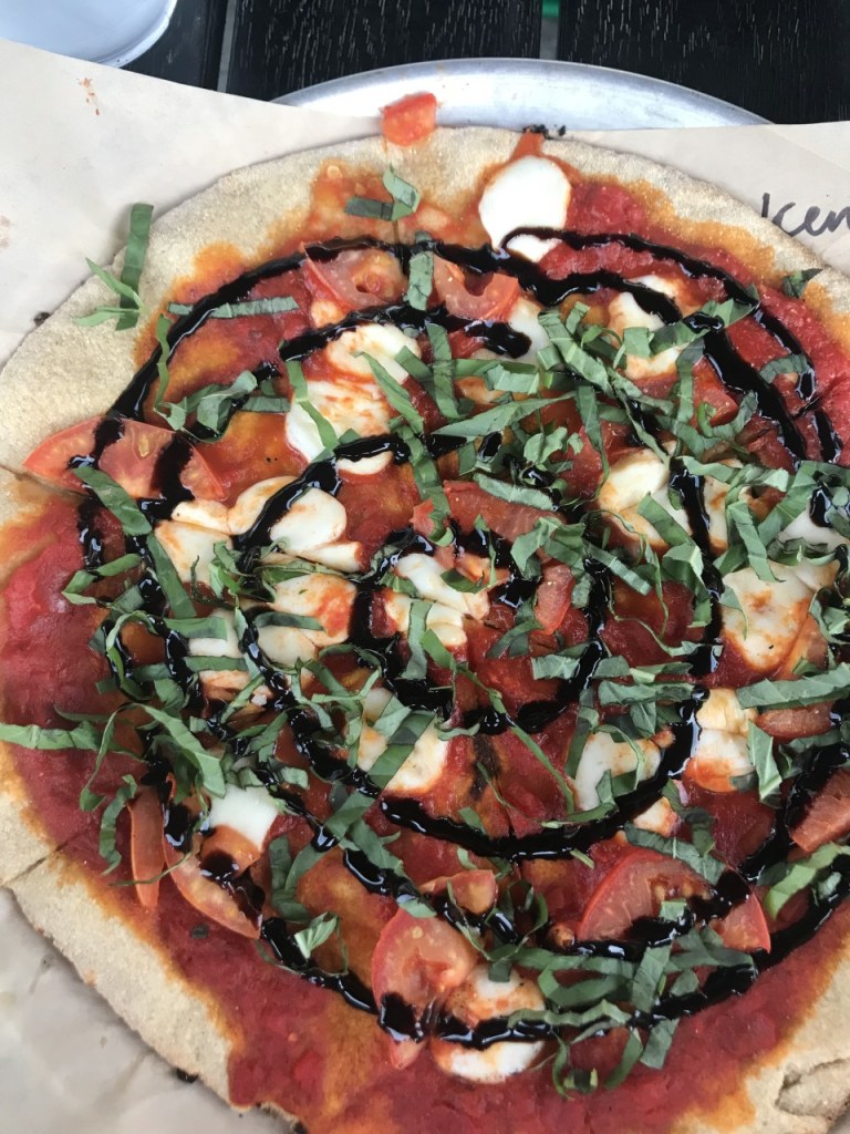
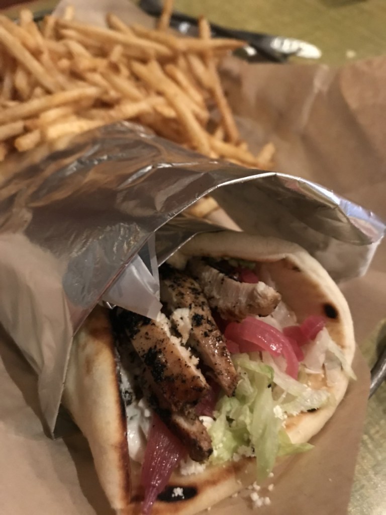
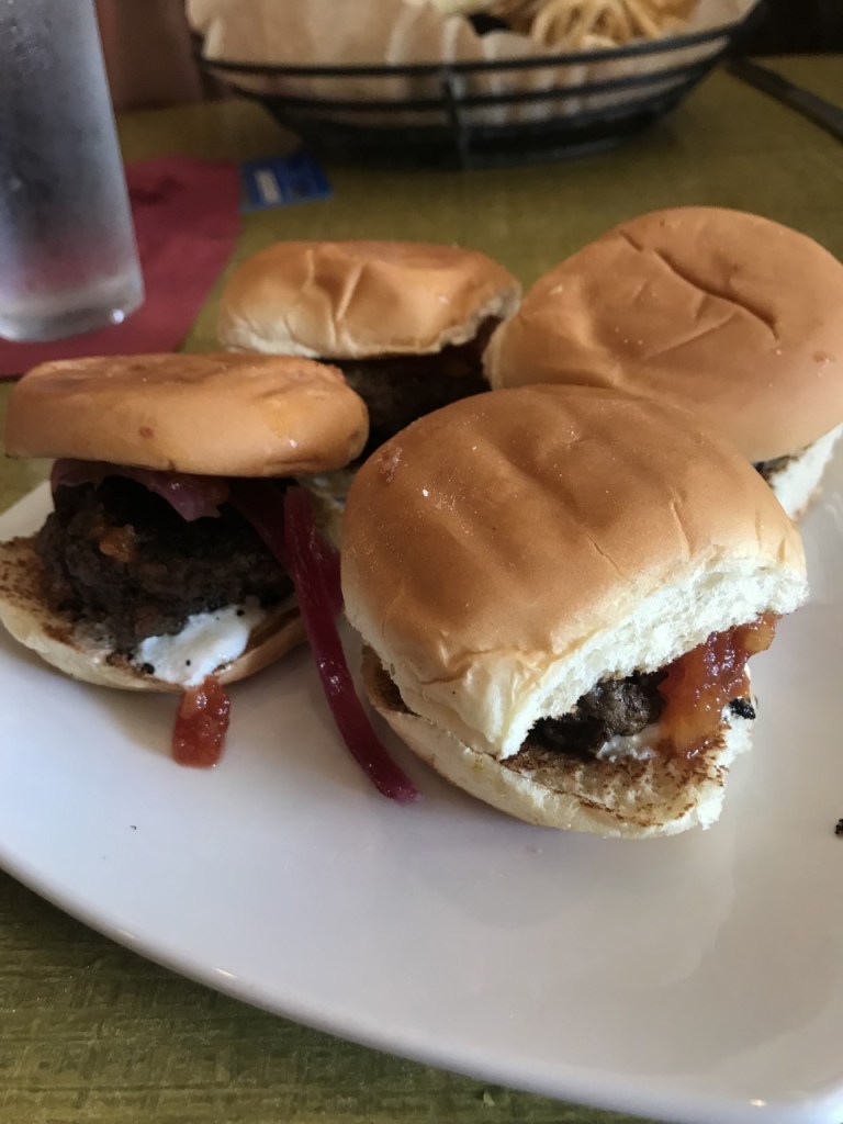
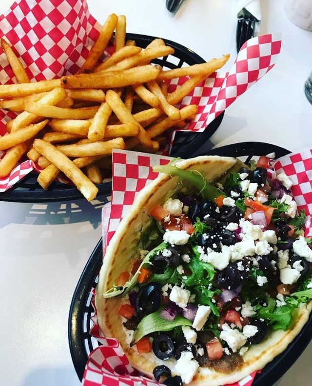
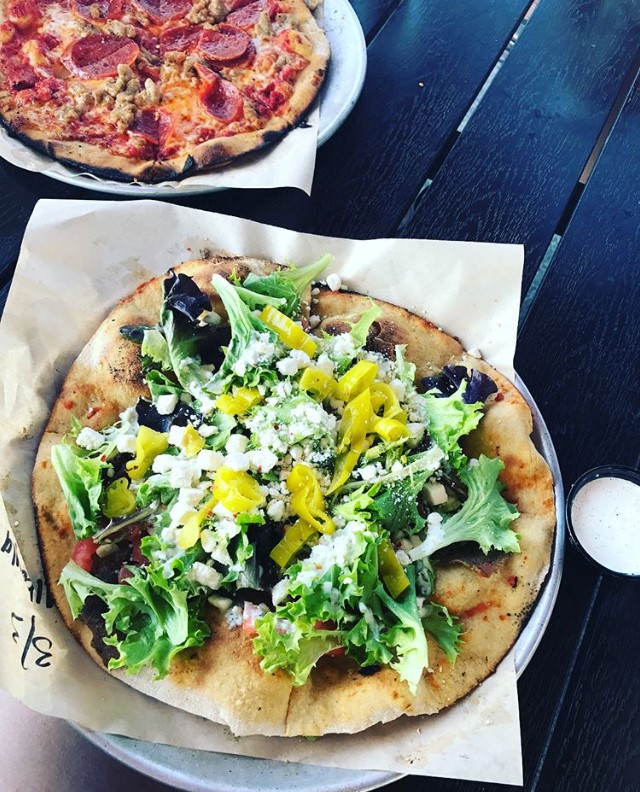
With my topic of food reviews of Palouse restaurants, I collected photos that I have previously taken of meals at Pullman restaurants for my graphic design project. My idea for my graphic design project is a graphic for my blog that uses these photos to make a visual representation of the foods that I will be reviewing on my blog. All these photos were taken by me and are from meals that I have enjoyed and that I would be able to write more about.
Here are my finished products from the Photoshop tutorials.
If you were to ask your best friend what they ate for dinner last Monday, do you think that they would remember? In my experience, many people wouldn’t.
To me, eating food has never been a chore or a mindless activity, but rather my favorite parts of the day. I don’t want to forget what I ate last Monday for dinner because it probably was amazing! That is why I chose to create a log of the meals I enjoy every day so that I can look back and remember the experience.
My Instagram food blog, what I call my “Foodstagram”, was started my freshman year in college. My original intentions for creating this account was to keep myself accountable for making healthier choices in the dining hall (I’ve always had a sweet tooth). What it has become is a place to record the restaurants I tried for the first time, share the recipe I found online that I thought was amazing, and show off the newest foods from the grocery store I picked up that week. I found that this Instagram blog became therapeutic and I found a passion for reviewing restaurants and products that I am trying for the first time. Because of this, I believe my topic for this blog couldn’t be anything less than reviewing restaurants in the Pullman-Moscow area.
Within this blog I will be able to include original photos of the food I’m eating, videos of my meals start to finish, as well as audio stories about my experiences, good or bad, with these restaurants. Here are some photos that I have previously taken that give a basis of what that could look like.
Some examples of projects that can be completed with this topic are a logo design in Unit 2 that establishes myself as an aspiring food critic and that will add a sense of professionalism to my blog. For Unit 4, I would be able to create a video of my experience at a new local restaurant and I would be able to share how I believe they shape up against their local competitors.
Some of my inspiration for my topic choice comes from other bloggers who have successfully created careers with similar ideas.
Roadfood is a blog that has reviews of restaurants all over the United States and even includes routes you can take to visit the best restaurants in a particular region or state.
Much Ado About Fooding is another great example of what I aim to accomplish. This specific blog has an extra sense of professionalism and even goes as far as to interview chefs at certain restaurants.
Lastly, My New Roots is a blog that shares the design intent that I am striving for with my blog. I enjoy the clean, easy to navigate, and aesthetically pleasing layout and look of this blog.
I hope to share my passion and joy about food with more than just my instagram following, and look forward to the creative assignments that follow this course.
Best,
Addison
